


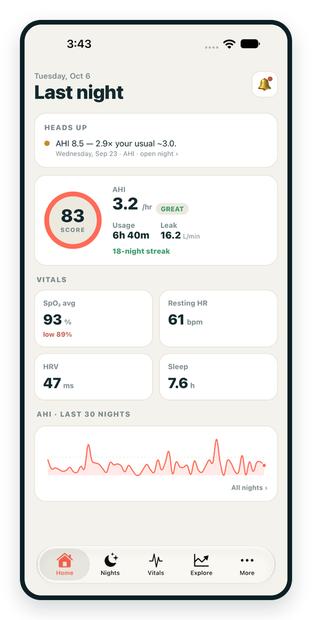
iPhone / iPhone Duo Live
Last night before you are out of bed. Apple Health vitals, Face ID.
Download on the App Store Apnealytics
Free on every plan: unlimited imports, the full dashboard and your last 30 nights.
 Compatibility checkerWill my machine work?Type your model. You get a straight answer: supported, partial, waitlist, or why not.Check my machine
 If it writes an SD card, we probably read it. ResMed AirMini has no card, so no app can read it.
Sleep Check-up
3 of 6 checks done
Six short screeners, one picture of how you sleep. Earn a milestone for each, save results and get retake reminders.
Latest milestone: Sleepiness check done
 NEWTrack your 90-day compliance windowOpen the calculator
 13 free tools. No account needed — sign in to save results and fill answers from your own CPAP data.
Last night before you are out of bed. Apple Health vitals, Face ID.
Download on the App Store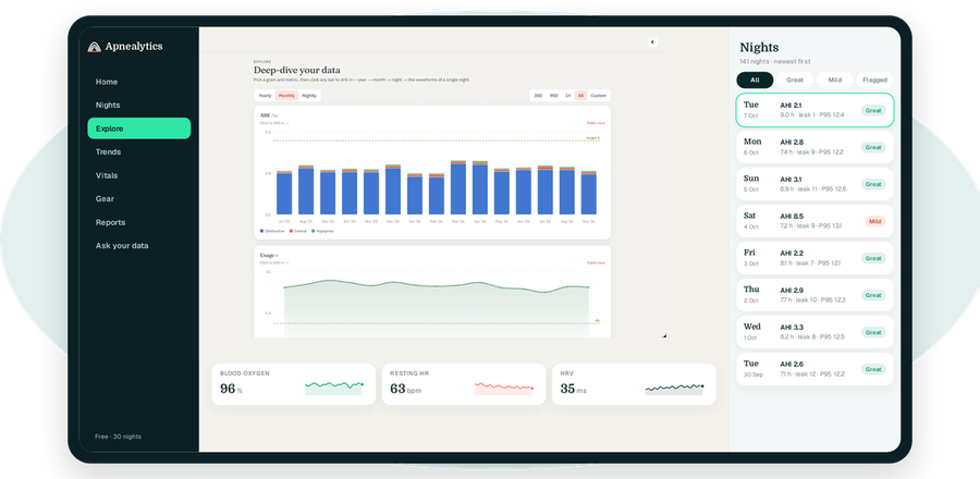
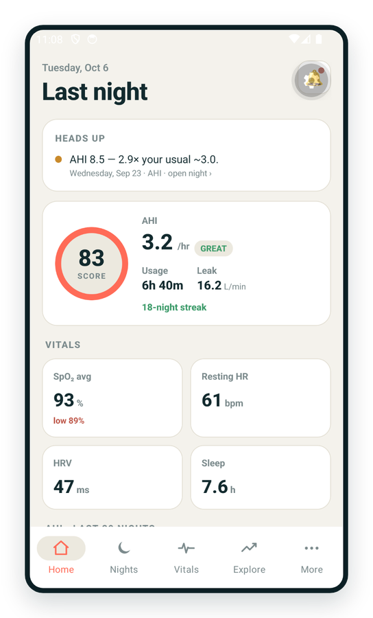
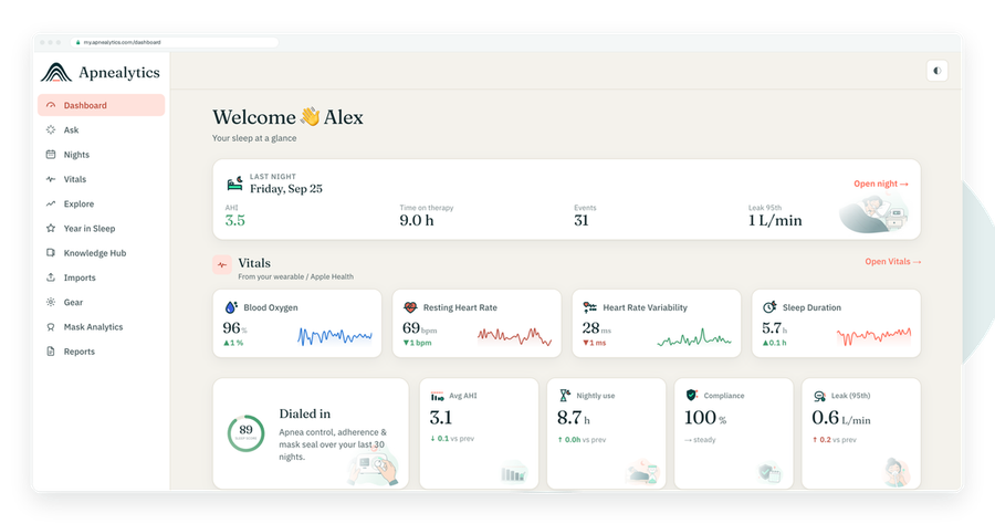
One account on every screen. Apple Watch vitals sync through Apple Health.
One bad night tells you little. Thirty tell you something, and three hundred tell you what actually changed. Apnealytics' CPAP trends view lets you move from a year to a month to a single night, compare periods, and see where your numbers turned.
Free on every plan · Web, iPhone, iPad, Android
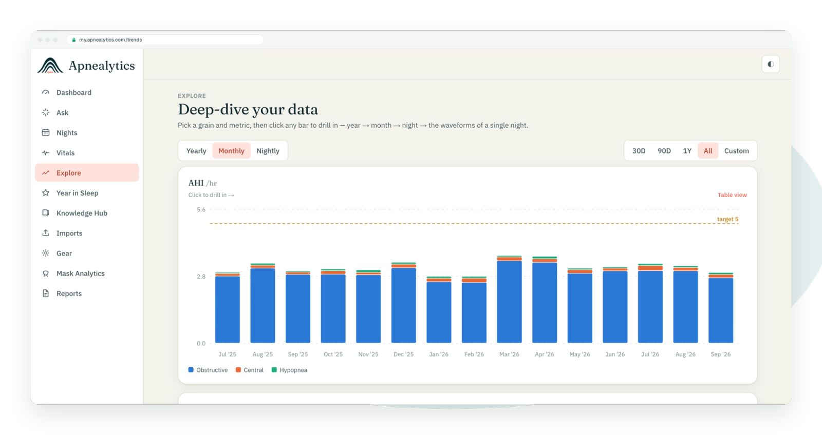
Trends and Explore are the long view of your therapy. Where the dashboard answers "how was last night?", Trends answers "is it getting better, and when did it change?". It covers AHI, usage, compliance, leak (95th percentile) and pressure over any range you choose, with hand-built charts that use one scale per axis and stay readable in light and dark mode.
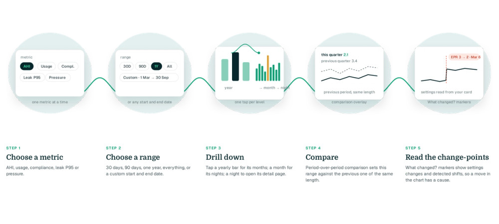
AHI, usage, compliance, leak P95 or pressure.
30 days, 90 days, one year, everything, or a custom start and end date.
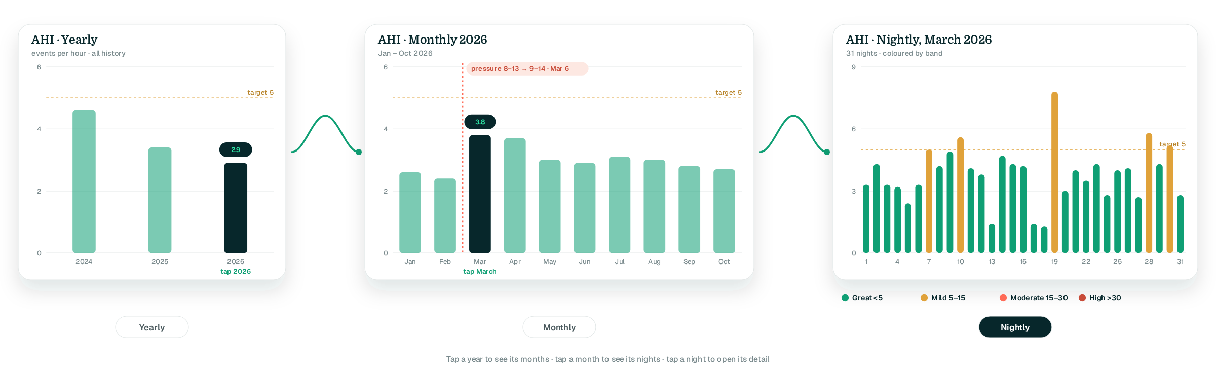
Tap a yearly bar to see its months; tap a month to see its nights; tap a night to open its detail page.
Turn on period-over-period comparison to set this range against the previous one of the same length.
The What changed? markers show settings changes and detected shifts in your trend, so you can match a move in the chart to a cause.
Three levels, each one tap apart. The yearly view is the quickest way to spot a long drift, such as leak creeping up as a cushion ages. The monthly view shows seasonal patterns and the effect of a settings change. The nightly view is the list of every night with its AHI band, usage and leak.
AHI — events per hour, in your familiar bands. · Usage — hours per night. · Compliance — the share of nights meeting the four-hour threshold, the figure insurers watch. · Leak P95 — how high leak reached for a meaningful part of the night.
30D, 90D, 1Y, All and custom. Comparison overlays the previous period so "my AHI is 2.1 this quarter versus 3.4 last quarter" becomes a picture instead of mental arithmetic.
Dated markers for settings changes read from your card, plus statistically detected shifts in the trend itself. Together they make a credible story to bring to a clinician: "my central events rose after the pressure change on this date".
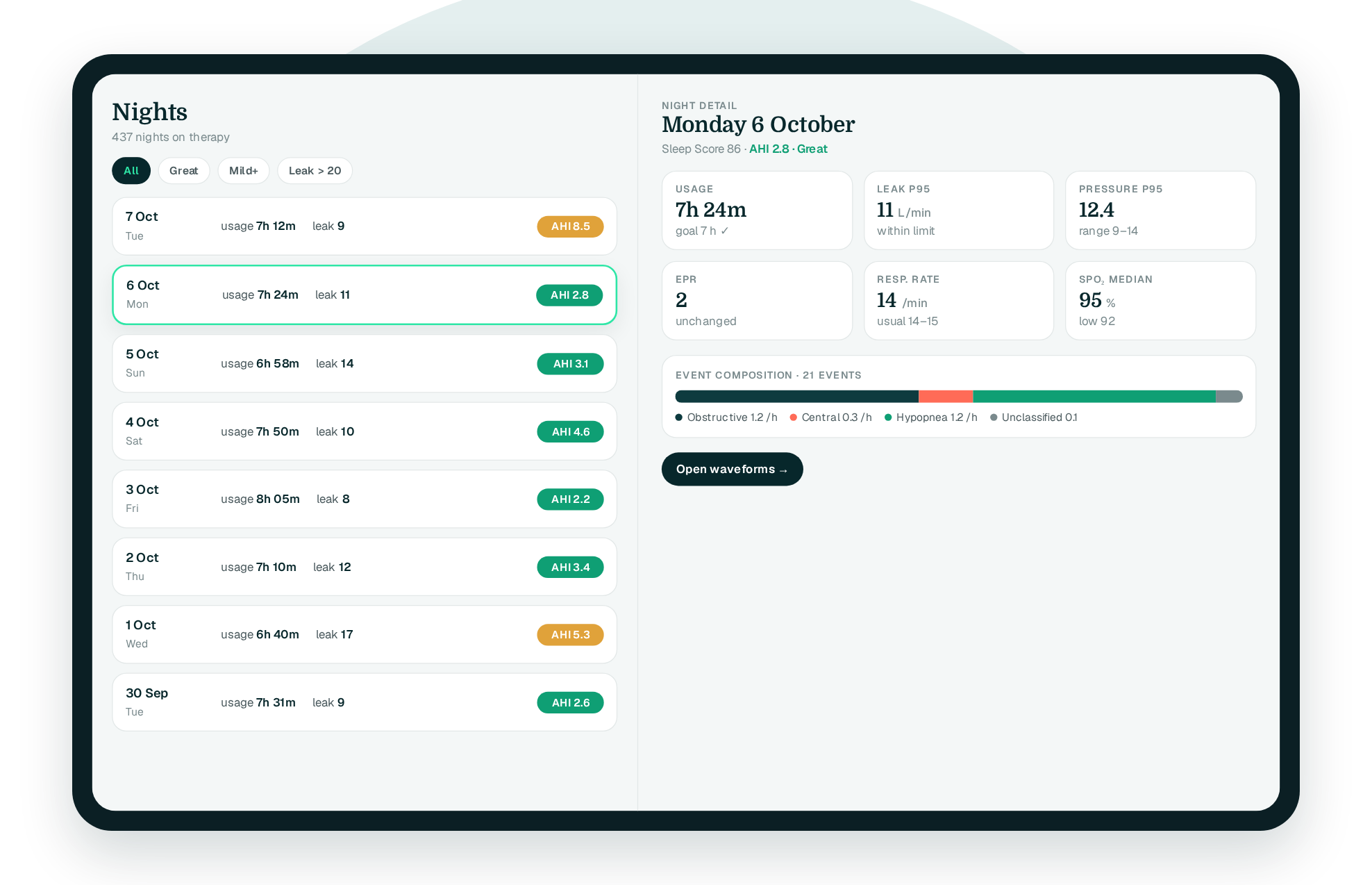
Every night on therapy as a card with date, usage, leak and AHI band. Filter or scroll, then open any night for event composition, leak P95, pressure P95 and set range, EPR, respiratory rate, SpO₂ median and total event count.
Trends and Explore are free for your last 30 nights. Pro unlocks your full history, which is where this view earns its keep: year-over-year comparisons, long-term change-points and the full Nights list back to your first upload. Pro also adds per-night waveforms from each night's detail page.
On the Free plan, your most recent 30 nights. On Pro, every night your card holds and every night you have ever uploaded. ResMed cards typically store a long span of summary data, so a first upload on Pro can show months or years of history straight away.
Yes. Pick a 30-day or custom range and turn on period-over-period comparison. The previous period of the same length is overlaid so you can see the two side by side for AHI, usage, compliance, leak or pressure.
The share of nights in the range where you used your machine for at least four hours. Insurers and clinics commonly look for 70 percent of nights over a 30-day window. The compliance report finds the qualifying window for you; Trends lets you watch the figure over time.
A date where your trend shifted in a way that is unlikely to be chance. Apnealytics marks two kinds: settings changes it reads from your card, such as a new pressure range or EPR level, and shifts it detects in the data itself. Both help you connect a change in your numbers to something that happened.
So they stay legible. Each axis has one scale, bands keep their colours across every view, and the charts adapt to light and dark themes. The goal is that a chart on your phone in the dark at 6 a.m. reads as clearly as one on a desktop monitor.
The web app is live today. iPhone and iPad are on the App Store. Android is on Google Play. Your first 30 nights are free, forever.
 DashboardSleep Score, AHI band, leak and pressure
 Trends & historyA year down to a night
 Breath-by-breath viewerAirflow, pressure, leak tracesPro
 SpO₂ overlayOximeter data on the same nightPro
 Pressure insightsP95, set range, EPR and ramp
 SD card importDrop the card folder, only new nights added
 Mask fit & gearWhich mask actually seals
 Ask your dataPlain-English questions, your own AI keyBYOK
 Year in SleepYour therapy year in one storyNew
 Compliance reportFinds the qualifying window for youPro
 Share with your doctorRead-only, revocable links
 Companion appiPhone, iPad and Android
 Privacy & securityYour data, locked to you
 ResMed AirSense 10 & 11Supported
 ResMed AirCurve 10 & 11 VAutoSupported
 ResMed S9 / LumisSupported
 Philips DreamStation 1 & 2Supported
 Fisher & Paykel SleepStyleSupported
 Löwenstein / DeVilbissPartial
 React Health Luna G3Waitlist
 Transcend MicroWaitlist
 Full face masksFit, leak signature, Mask Analytics
 Nasal masksOver-nose and cradle styles
 Nasal pillowsMinimal-contact fit tips
 Wellue O2RingSupported
 Contec CMS50 familySupported
 Apple Health / Health ConnectResting HR, HRV, SpO₂, sleepSupported
 What is AHI?The apnea-hypopnea index, explained
 What is a good AHI on CPAP?
 CPAP leak rate explained
 Pressure settings explained
 Reading CPAP waveformsAll 14 explainers
 Apnealytics vs SleepHQ
 Apnealytics vs OSCAR
 Apnealytics vs myAir
 Apnealytics vs DreamMapper
 SleepHQ vs OSCARBest CPAP apps in 2026
 How to read CPAP dataStart here: six numbers, in order
 Read your CPAP SD card
 Share data with your doctorChoosing a CPAP mask
 Travel with CPAPAll guides
 Mask finderSeven questions, a ranked mask typeYour data
 Machine finderA two-machine shortlist for your prescription
 iPhone / iPhone DuoLast night before you are out of bed. Apple Health vitals, Face ID.Live
 iPadSame universal app, side-by-side panes and full-width waveforms.Live
 AndroidPhones, tablets and foldables, with Health Connect built in.Live
 Web portalWhere your SD card goes. Every chart, report and setting.Live

